KO Syrups
art direction / branding / packaging
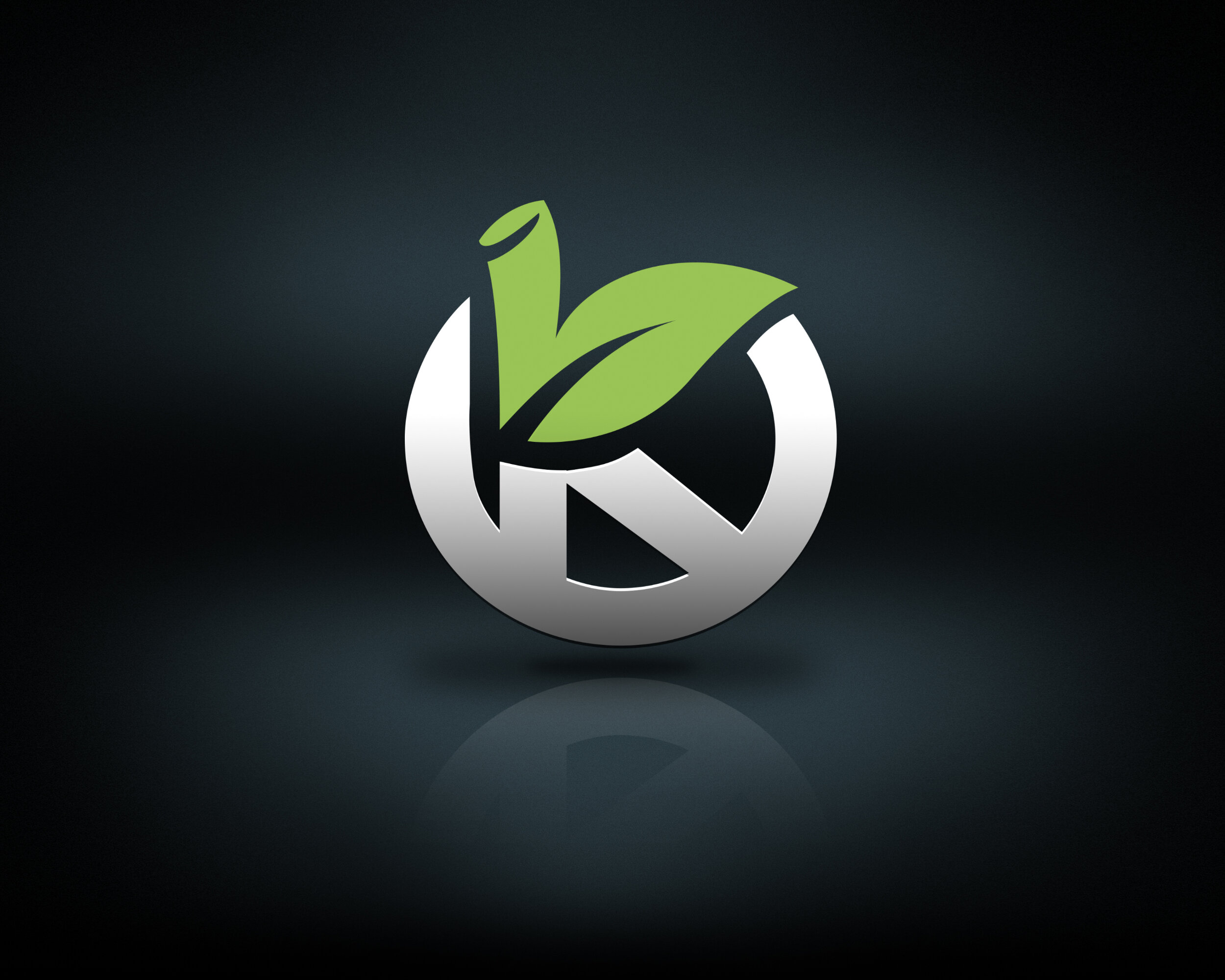
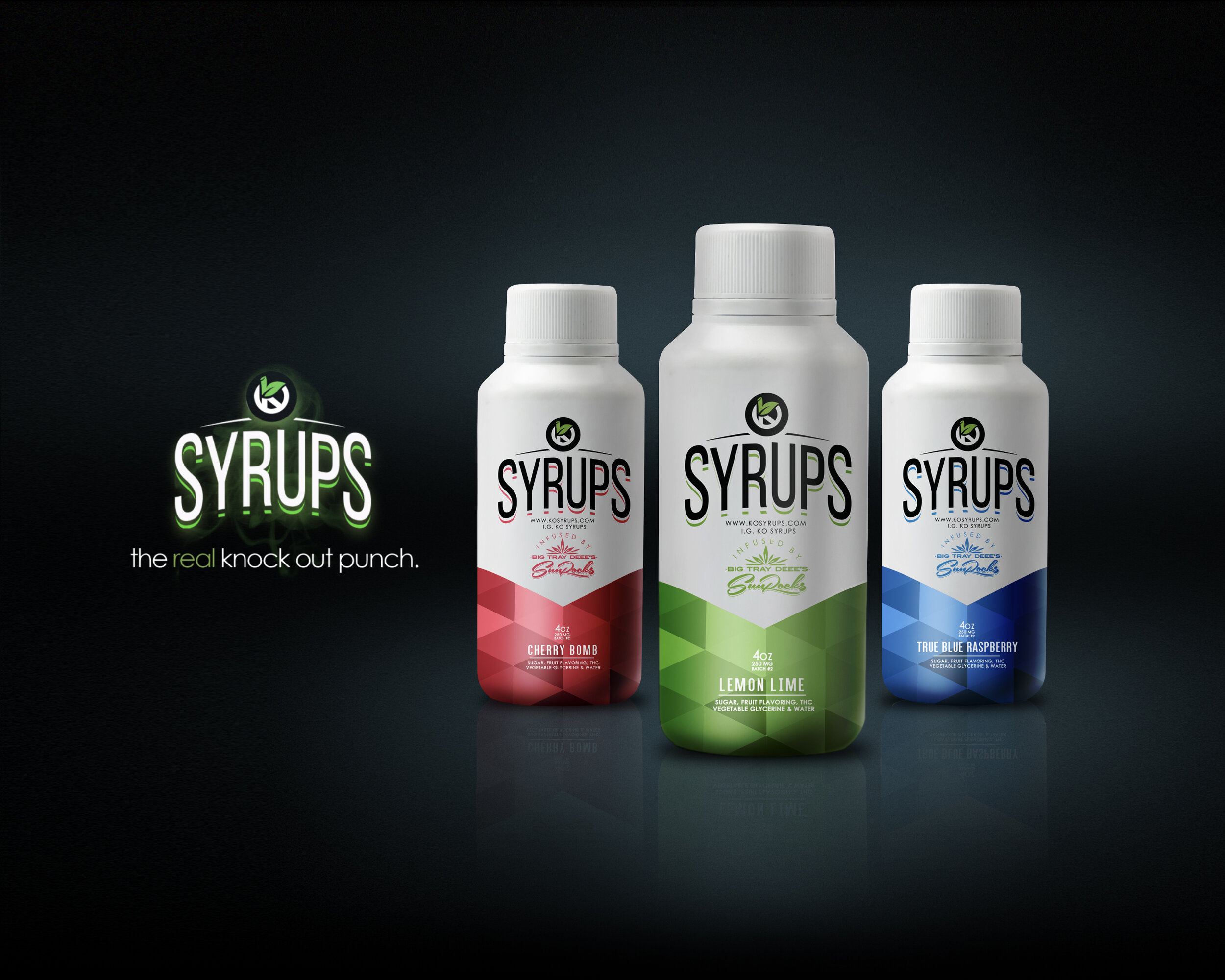
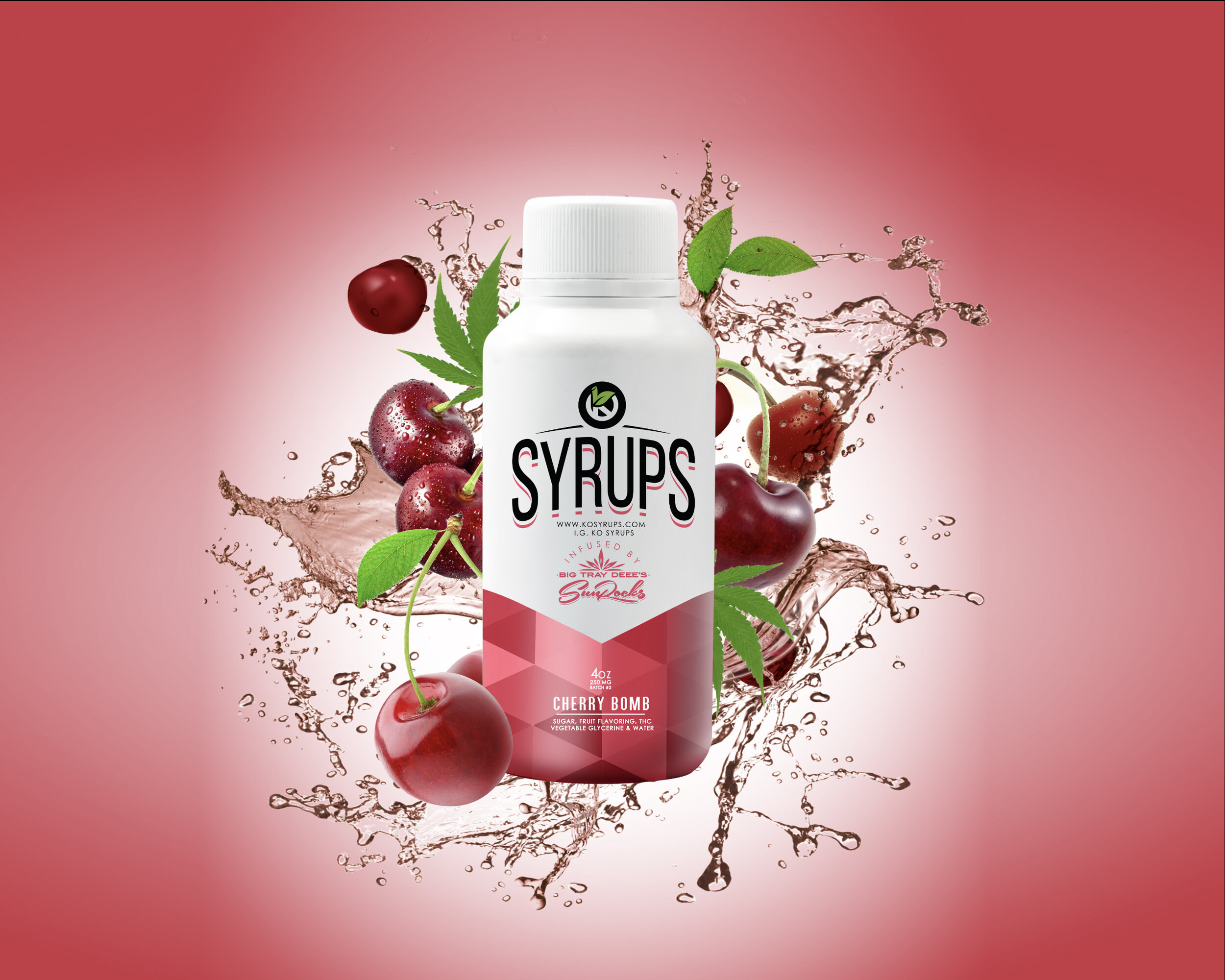
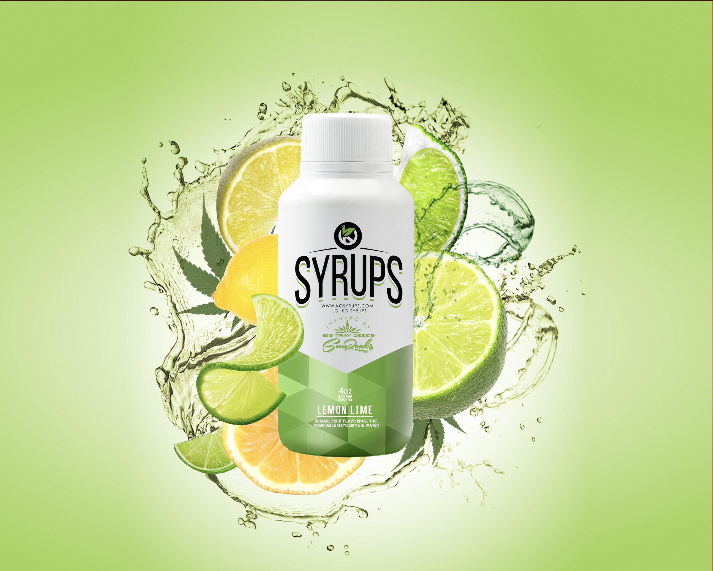
KO Syrups is an energy drink company whose multi-flavored product line required a stylish and colorful design aesthetic. Each bottle needed to stand alone on the shelf with other products while also maintaining a uniformity when alongside the various flavors of it’s brand. Each flavor of the KO Syrups advertising campaign received it’s own unique treatment. The “KO” icon combined an illustrated leaf and stem for the top half of the “K”, indicating the brand’s organic flavor ingredients. Next was wrapping the letter “O” around the border of the icon giving it a sleek and fashionable feel just minimal enough to be legible from afar and just stylish enough to stand alone (as a great icon should).
Overall, the utilization of it’s iconic branding provides each product from KO Syrups with an instantly captivating effect while leaving a lasting impression.